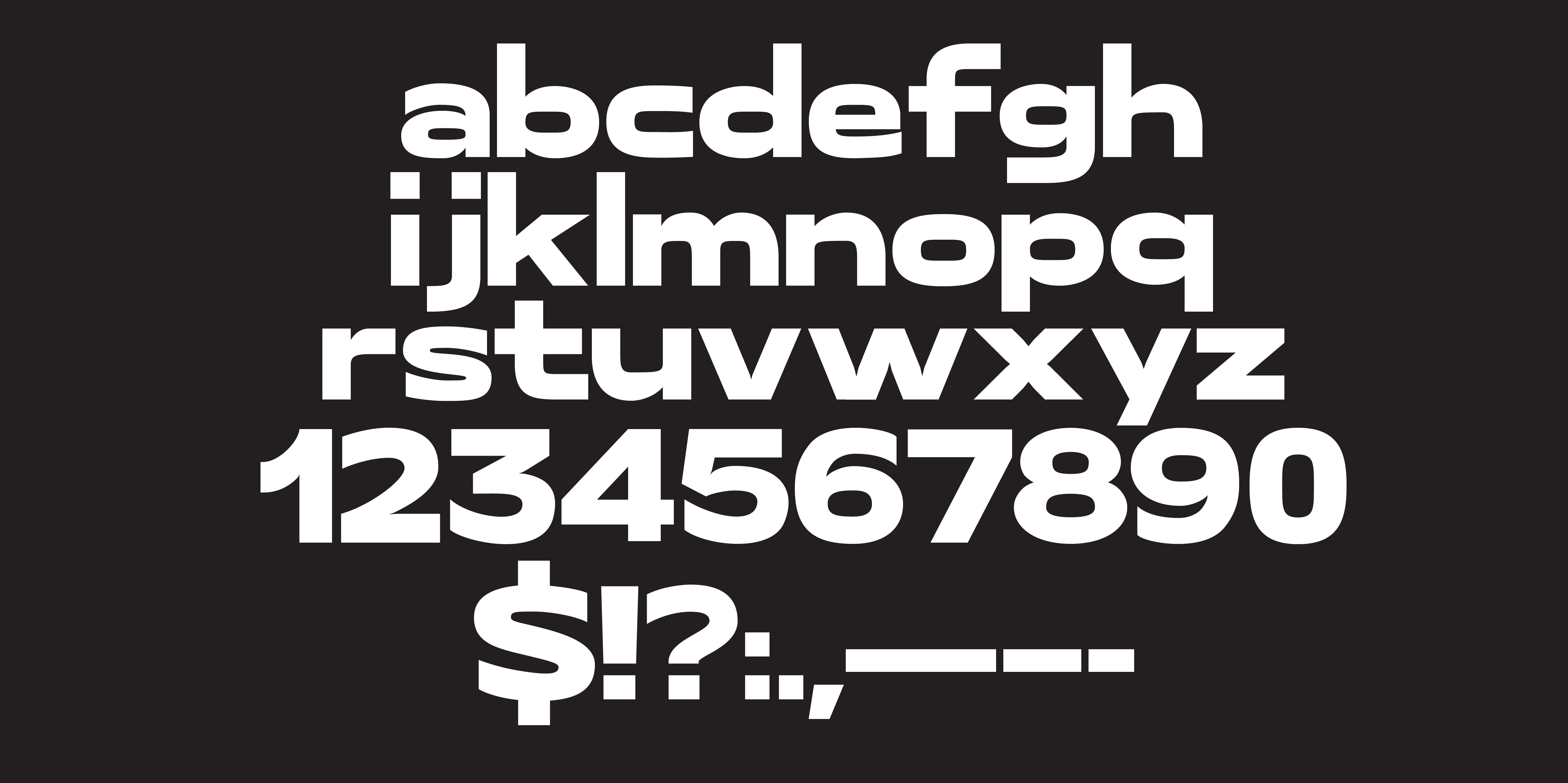
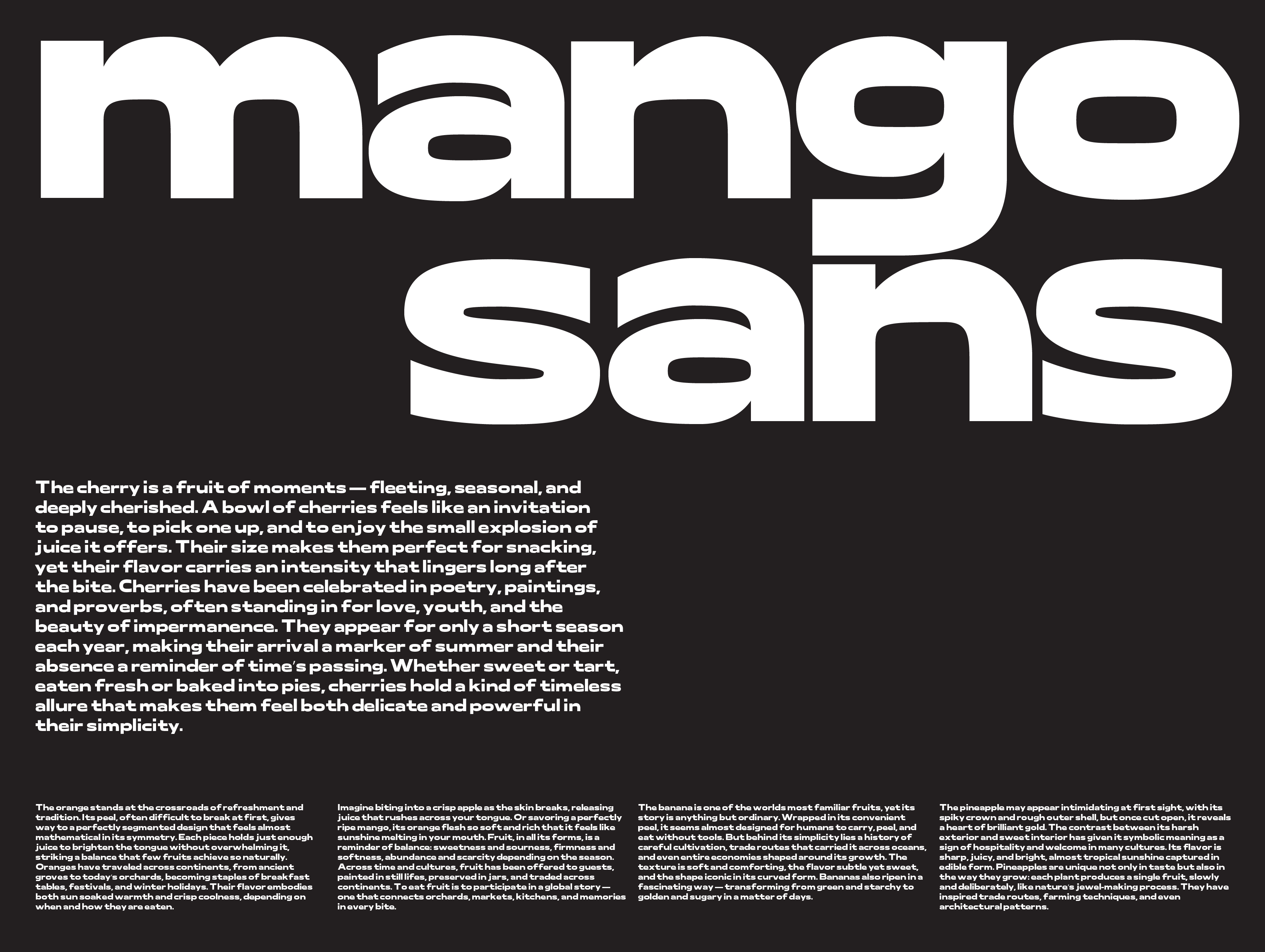
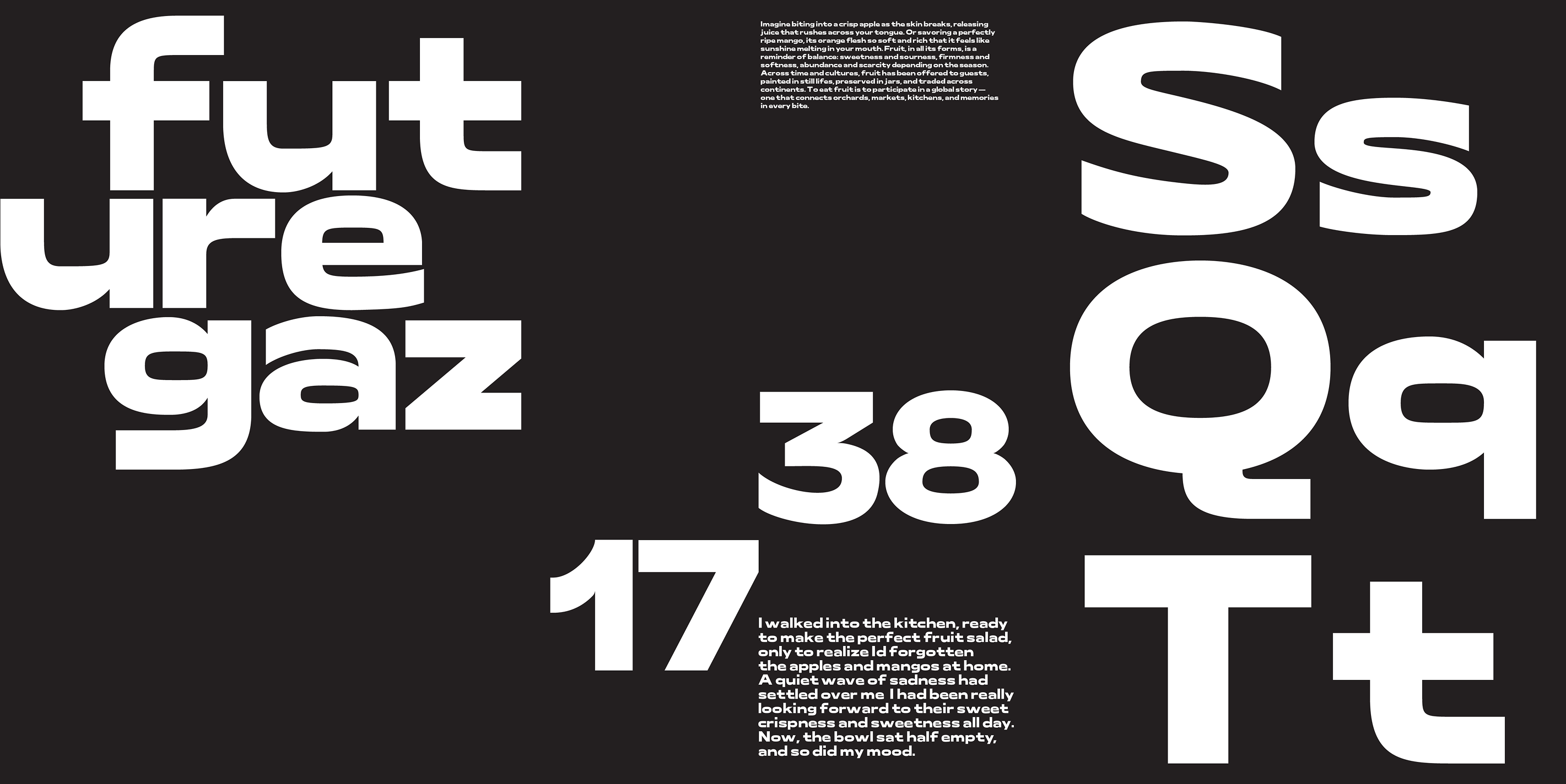
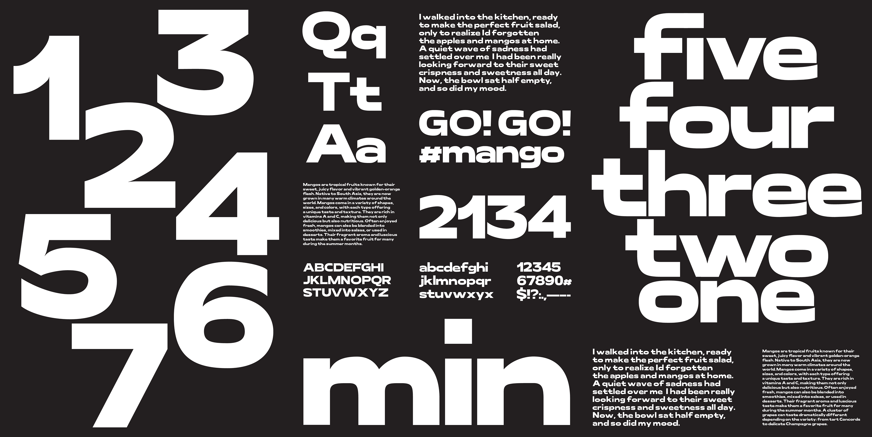
Mango Sans
Designed with confident shapes and energetic rhythm, it brings a modern edge to any composition. Mango Sans is a lively display sans-serif crafted for bold expression
Interaction, Identity, Research
Font Concept
This typeface was designed to capture a sense of sweetness and playfulness, built to stand out at large sizes with a distinct personality. While inspired by geometric classics like Futura, my approach was to push beyond minimalism, infusing it with expressive, dynamic qualities that mirror the lively and vibrant character of a mango.
I experimented with proportions and curvature to soften the rigidity of pure geometry, allowing the forms to feel more approachable. The goal was to create a balance between structure and charm, giving the typeface both clarity and individuality.