Strava
A bold and transformative new identity for Strava marks the beginning of an exciting chapter for the globally beloved athletics platform, redefining how athletes connect, compete, and celebrate their fitness journeys.
Interaction, Identity, Motion
Identity Narrative
Strava has grown from a basic fitness tracker into a global platform that connects athletes and celebrates fitness journeys. The rebrand focused on engaging a diverse audience by designing for their unique needs and experiences. I worked to create a dynamic visual identity that reflects energy, movement, and community. The redesigned mobile and watch apps enhance the user experience, making progress tracking and discovering new challenges effortless.
The goal was to design a platform that feels personal, empowering athletes at all levels. This project wasn’t just about aesthetics; it was about understanding the user’s journey and creating meaningful connections. I worked to create a dynamic visual identity and graphic system that reflects energy, movement, and community, ensuring a seamless connection between the interface and collateral design while enhancing the user experience across digital and physical touchpoints.


Interface Design
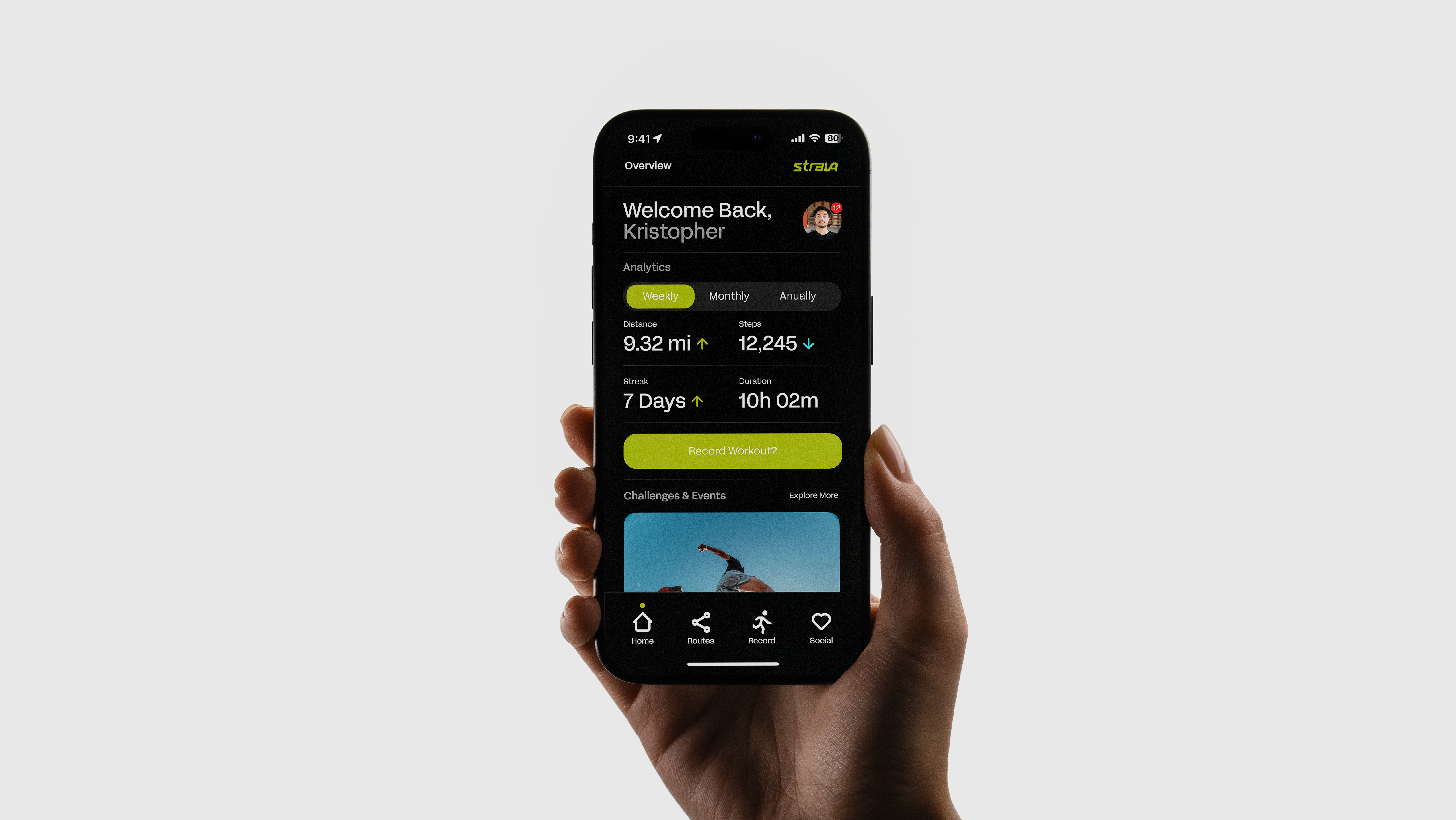
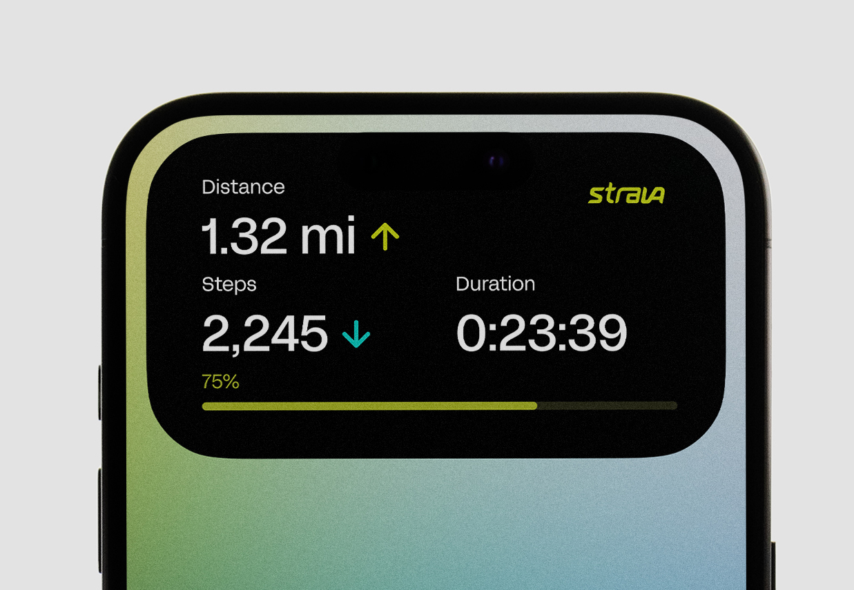
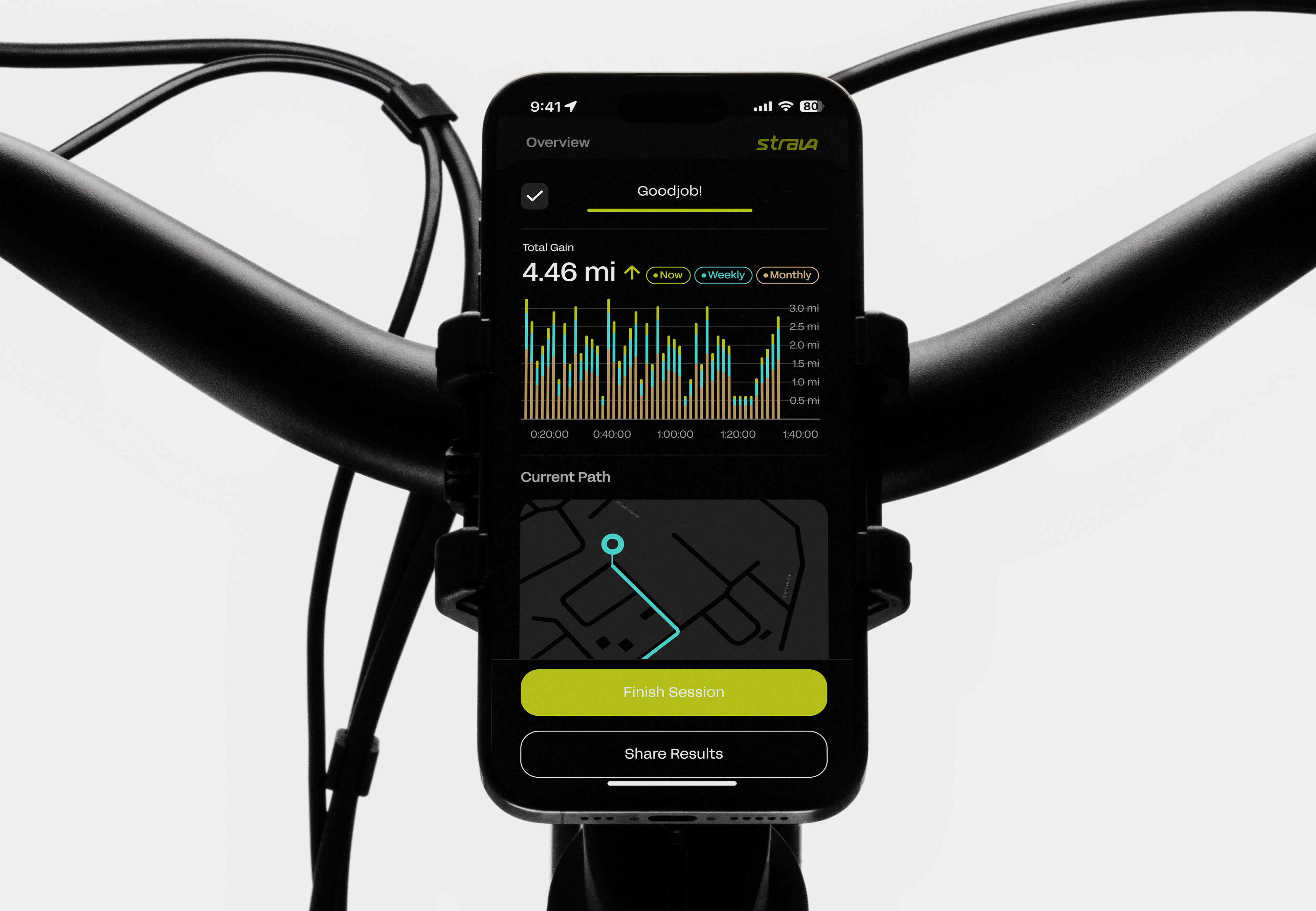
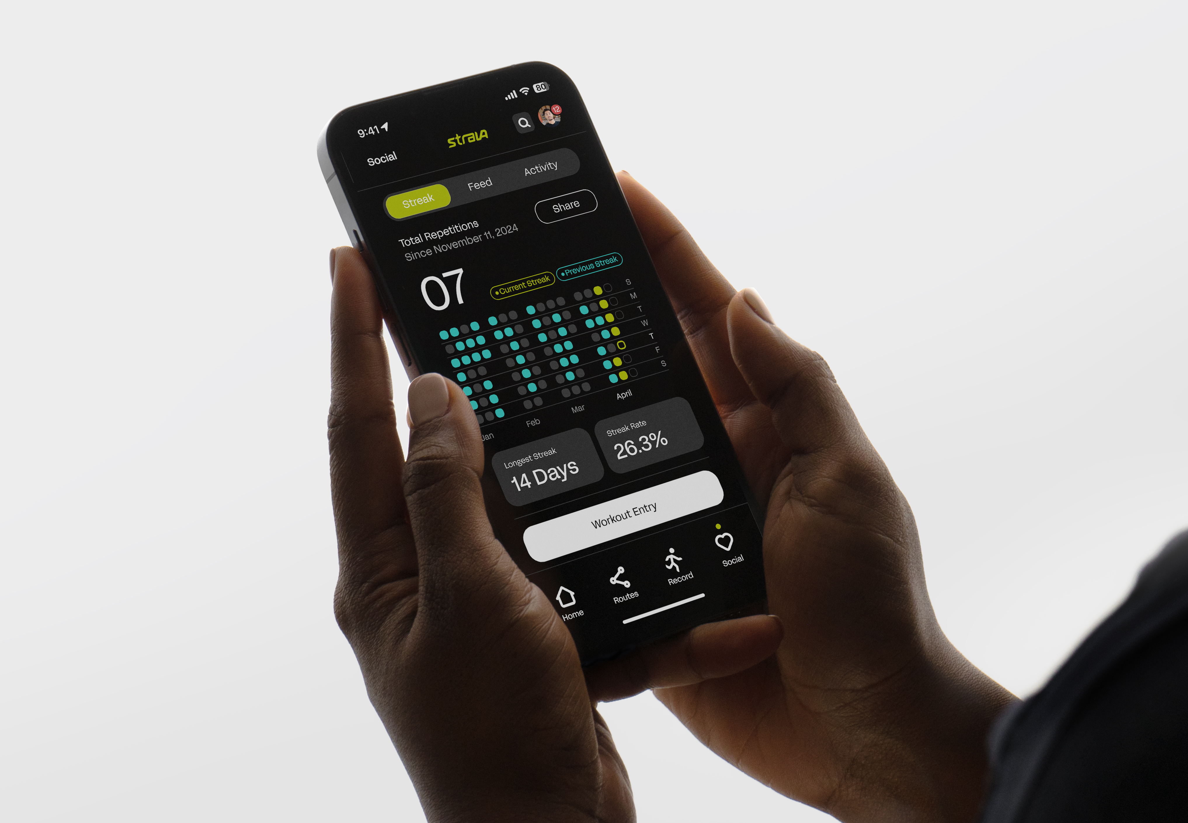
Strava’s rebrand focused on balancing social connection with personalized fitness goals. I designed with the user in mind, especially beginners, ensuring the app was intuitive and accessible. By improving information architecture, I transformed data into motivation, making progress tracking central to the experience.
New features like the community-based routes guide fostered local connections, while smartwatch integration streamlined functionality. The design prioritized ease of use, allowing users to quickly start workouts. The result is an empowering, cohesive system that aligns with Strava’s commitment to supporting every user’s fitness journey.

User Mapping
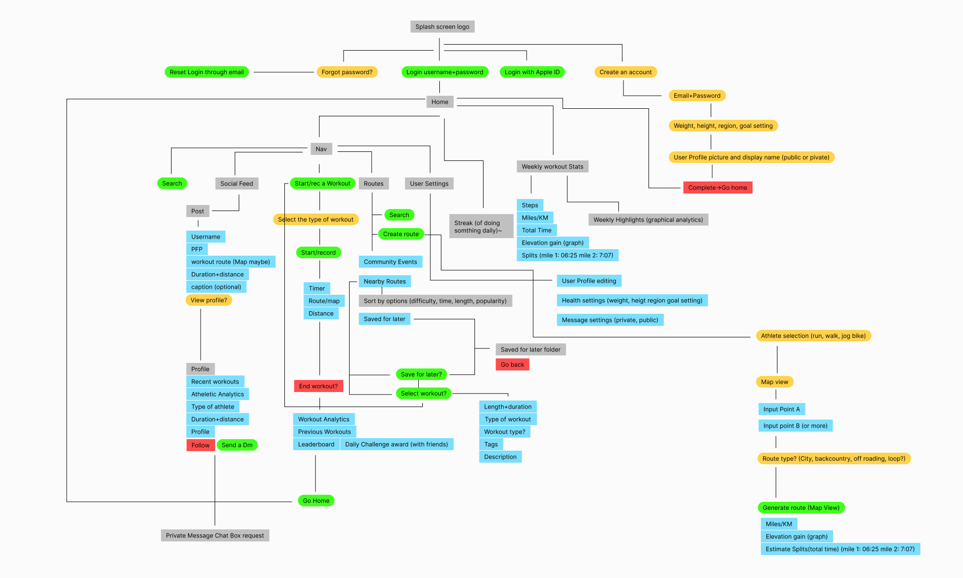
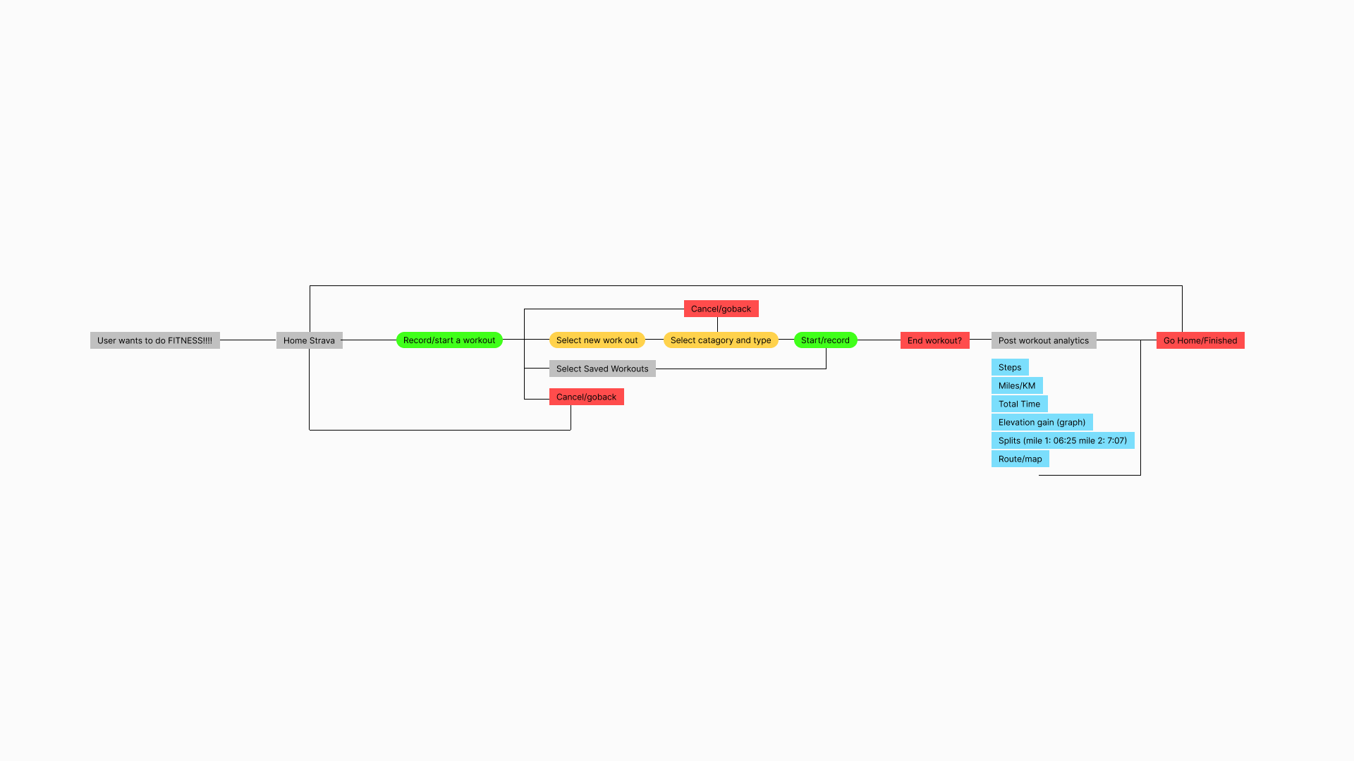
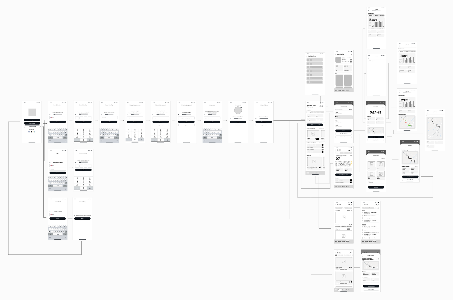
The UX process began with questioning how to improve both the user experience and overall flow. I mapped out potential platform architectures, then conducted user interviews to uncover what active users valued most. The research revealed that while social features mattered, users wanted the app to prioritize fitness above all and not be cluttered with too many social related interactions.
This insight led me to structure the experience around workouts and progress, with social elements playing a supporting role. From there, I mapped key scenarios like onboarding and starting a workout, which directly informed the wireframes. This research-driven approach shaped the project’s direction and deepened my understanding of user expectations.

Identity Design
Strava’s new identity was created to connect with a global, diverse audience while staying true to its roots. I developed a custom typeface for the wordmark, designed to be versatile across platforms and embody Strava’s energy and inclusivity. The 78-degree angle within the wordmark symbolizes momentum and progress, resonating with users’ drive to improve.
I introduced the tagline “Move with the world” to reinforce the community aspect that Strava fosters. The icon system, built around the same grid and angle, creates a unified visual experience that enhances functionality. This rebrand reflects Strava’s evolution, empowering users to feel connected and motivated, no matter where they are.
Color System
The new color system for Strava moves away from its old palette to create a more dynamic, energizing experience. I selected hyper green, electric blue, and sand beige to evoke emotions that resonate with both beginners and seasoned athletes. These colors work together cohesively, offering flexibility while inspiring energy or calm, depending on the context.
The palette is designed to motivate users, whether they need a burst of excitement or a welcoming, laid-back vibe. This system reflects Strava’s goal to connect with a wide range of users and support their unique fitness journeys. The result is a versatile, emotional color scheme that strengthens Strava's brand and mission.


Collateral
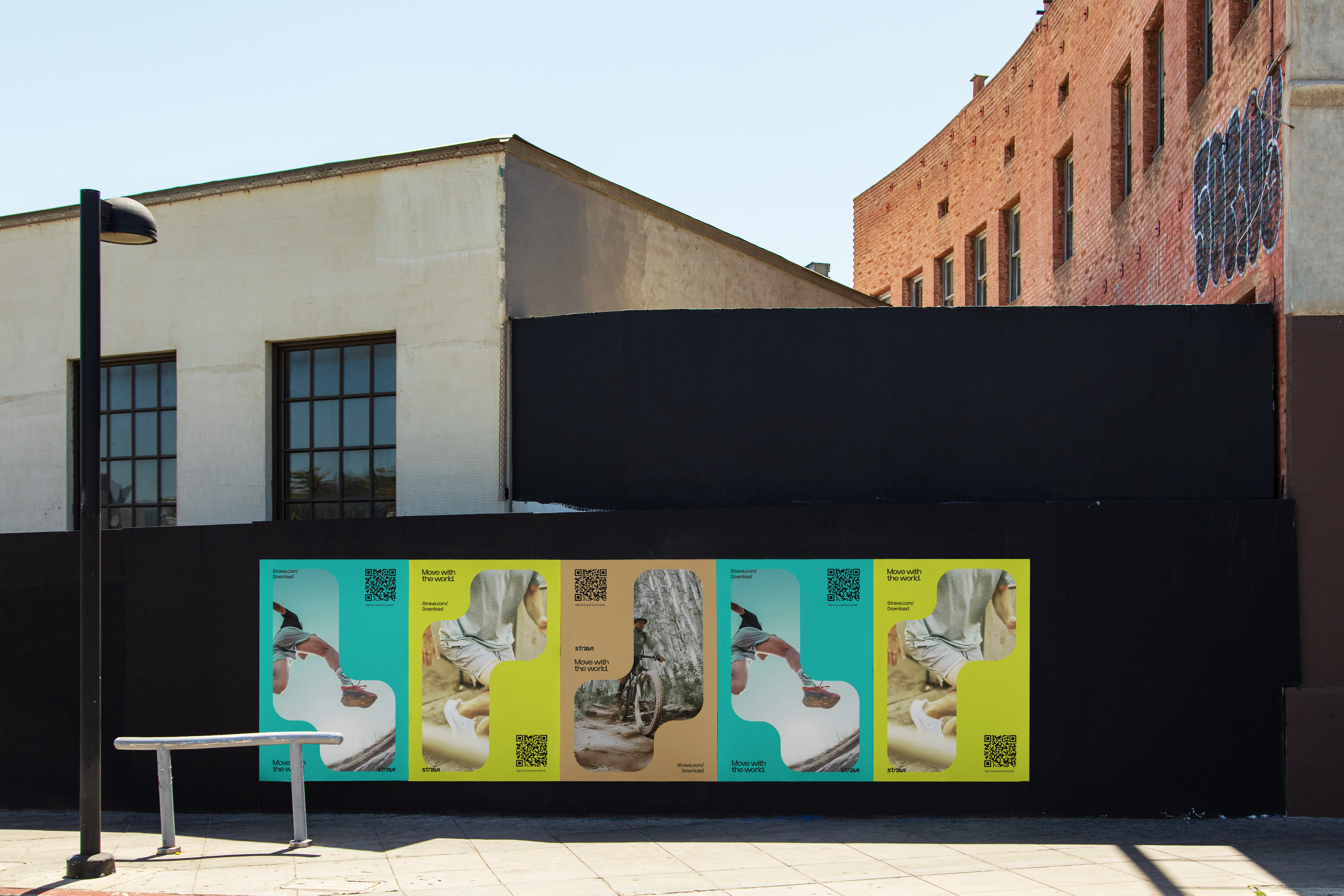
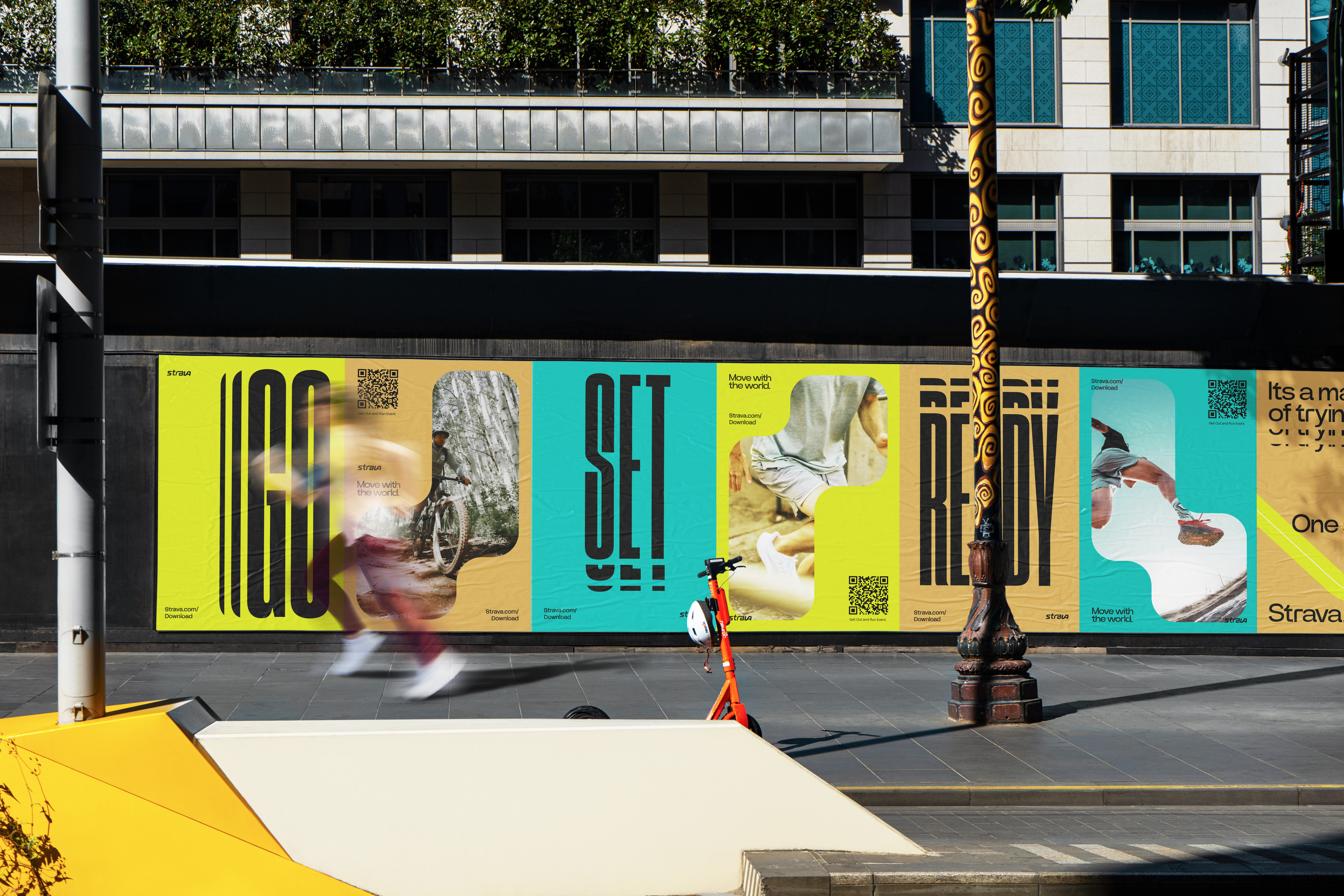
The new identity system adapts seamlessly across digital and physical collateral, from motion graphics to print materials. I designed it to communicate Strava’s core values—energy, movement, and progress—whether through dynamic visuals or the tactile impact of printed items. The system maintains consistency and engagement across all formats, reinforcing Strava’s presence and strengthening its brand.
Graphic elements highlight athletes in inspiring ways while tying back to Strava’s central feature—routes—emphasizing direction and growth. This approach ensures that the identity feels relevant and motivating for users, no matter where they interact with it. The result is a cohesive system that amplifies Strava’s mission to connect and inspire.
