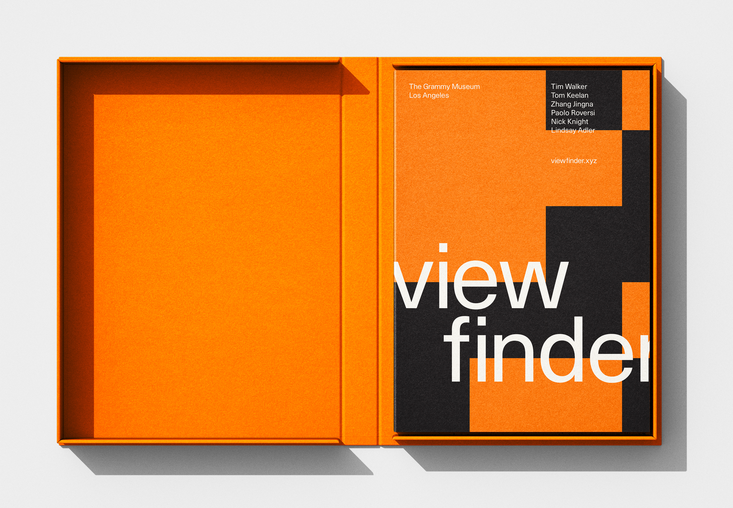
Viewfinder
An exploration of the typographic print extension and brand identity for a photography exhibition held in Los Angeles, California.
Editorial, Identity, Exhibition
Project Brief
This photography exhibition at the Grammy Museum showcases the works of Tim Walker, Tom Keelan, Zhang Jingna, Paolo Roversi, and Nick Knight. It highlights how these photographers use unique techniques to tell compelling fashion stories.
Visitors engage with books, posters, motion pieces, and digital content, gaining insights into the photographers’ creative processes through interviews and behind-the-scenes content. The immersive installation invites a deeper understanding of the artistry and vision behind each photographer’s work.
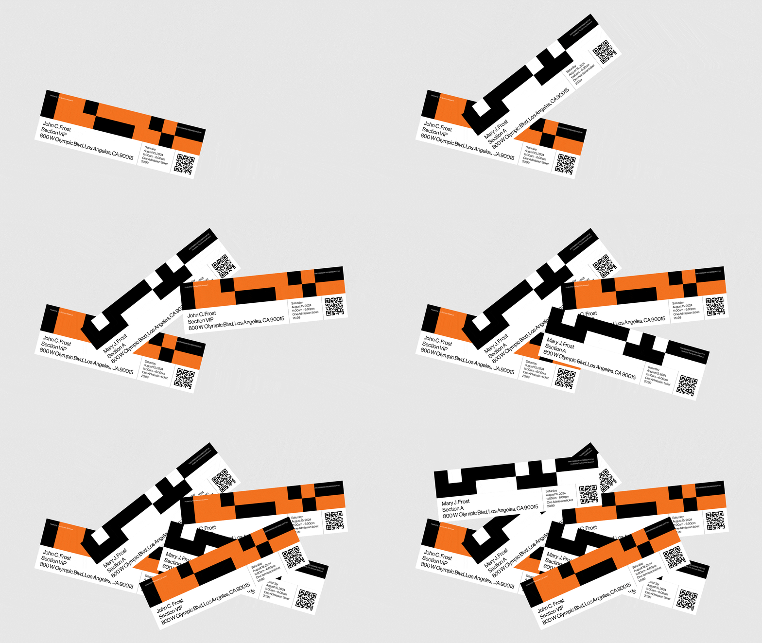
Event Way-findings
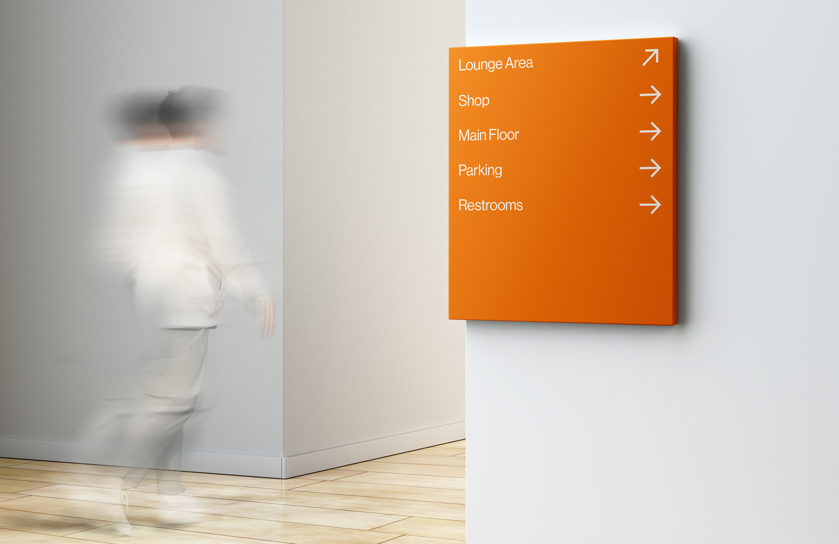
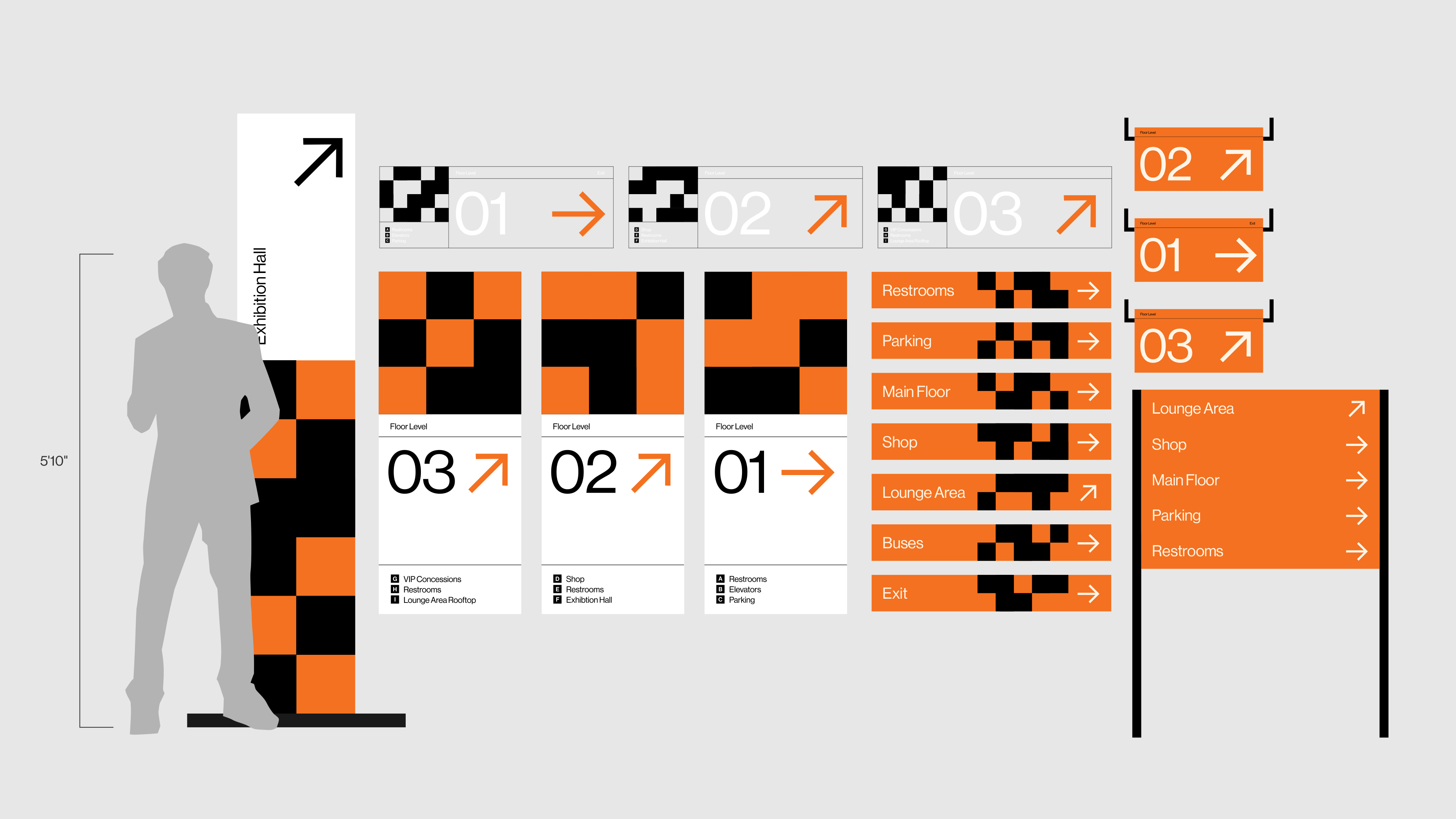
The wayfinding system was designed to help visitors navigate the complex downtown Los Angeles layout while reflecting the Viewfinder identity. I focused on simplicity and clarity to ensure intuitive navigation in a crowded environment.
Key elements like floor indicators, directional arrows, and elevator signage were strategically placed for ease of use. This approach ensured a seamless experience while staying true to the exhibition’s visual style.
Exhibition Identity
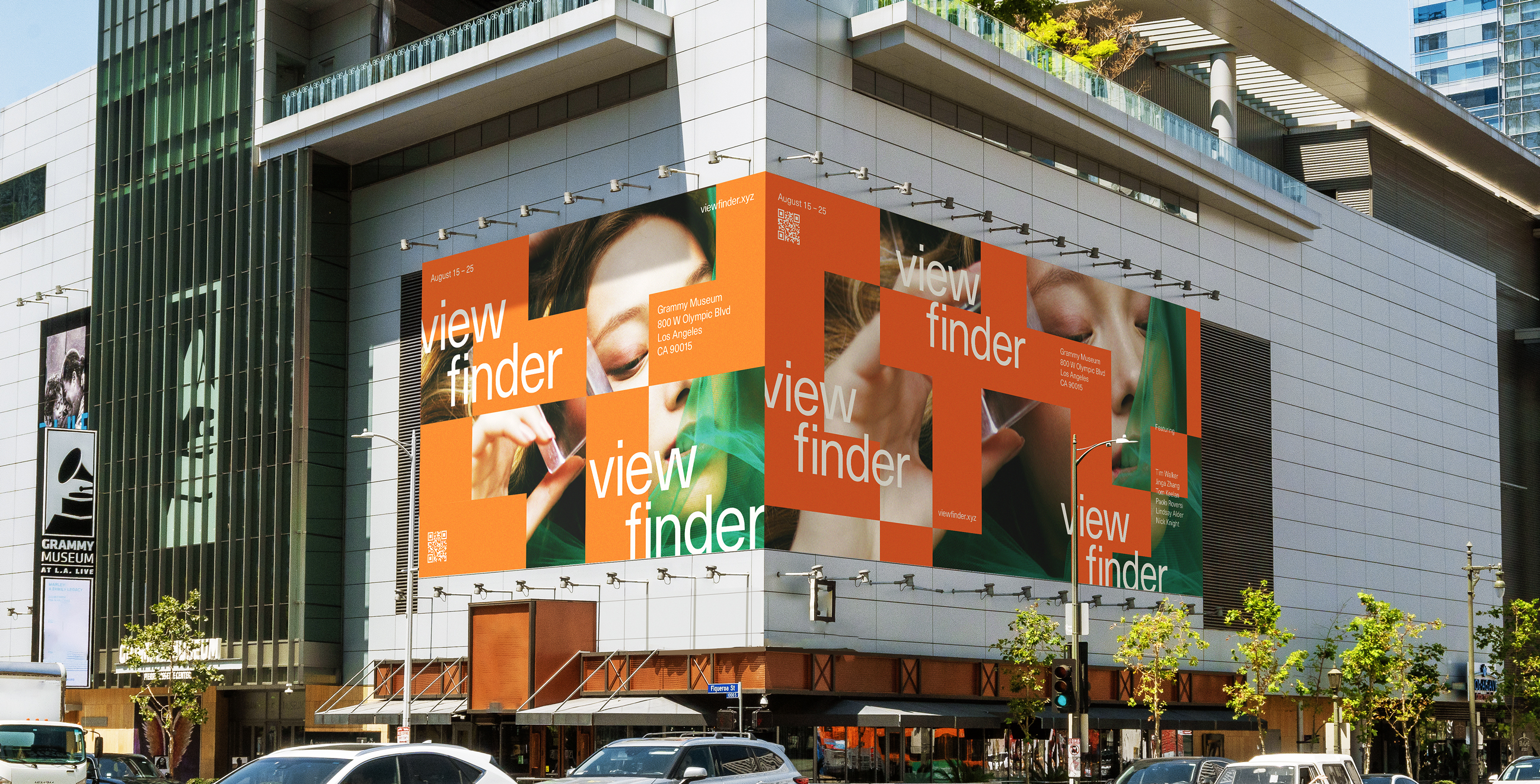
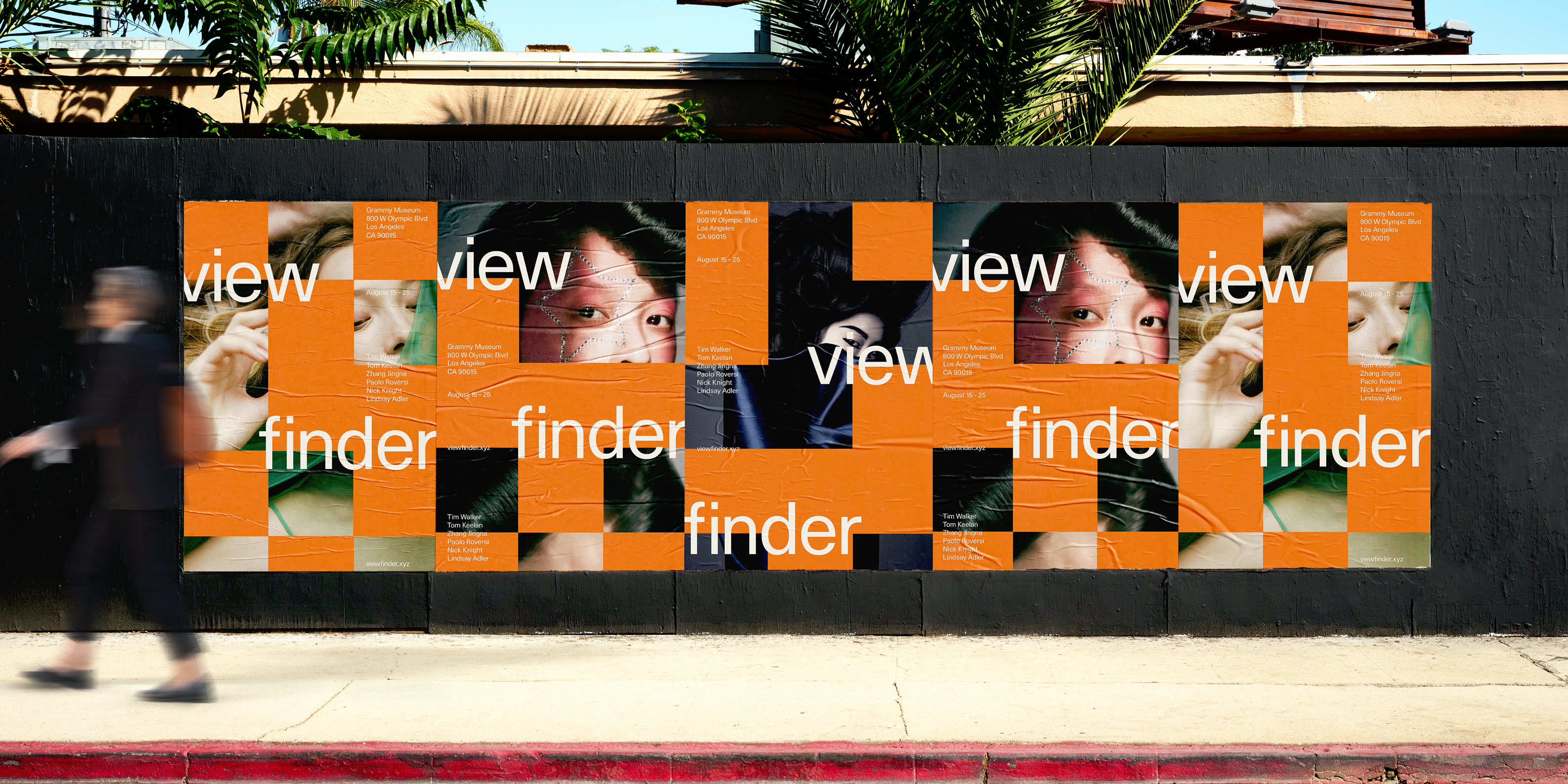
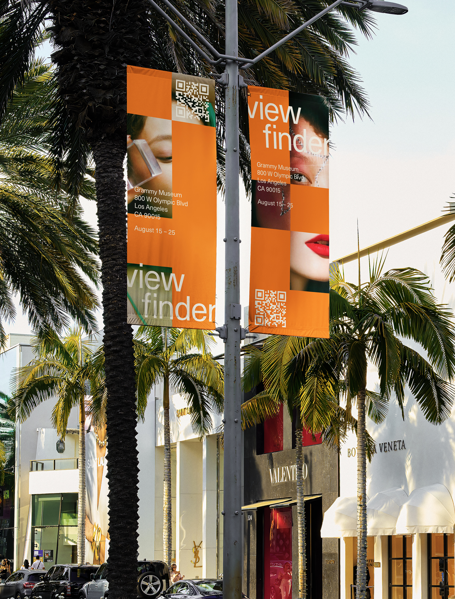
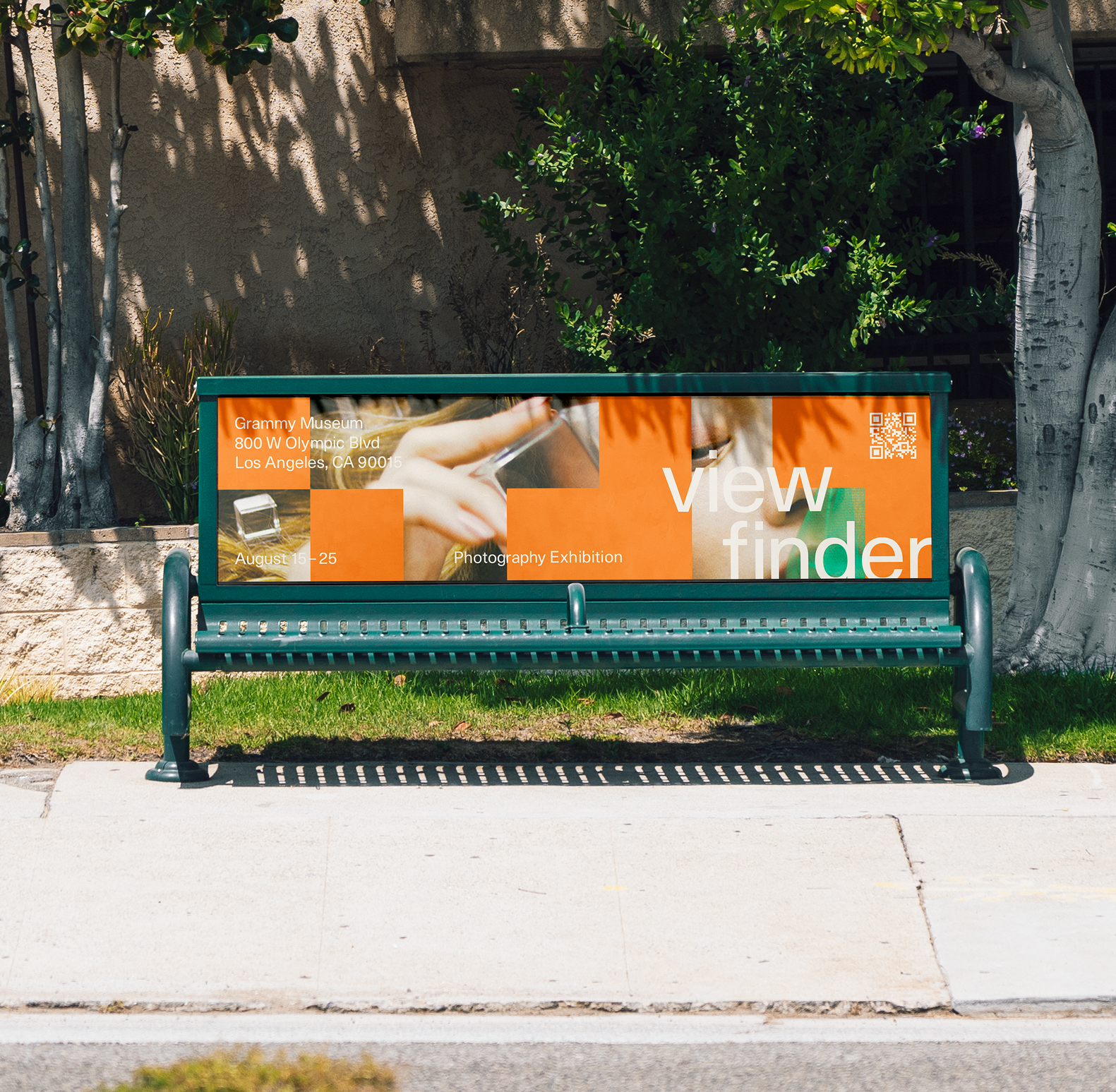
The project was designed to mirror the essence of the book: What exactly is the photographer capturing through their viewfinder? I translated this concept into various elements for out-of-home stationary pieces like posters, bus stop banners, and even extensions of exterior design for buildings.
The setting for these elements is the dynamic city of Los Angeles, as there’s flexibility in signage and public displays. I strategically placed these pieces in locations where viewers have the opportunity to absorb the information, providing context and details about the event amidst the city’s vibrant energy.

Editorial Concept
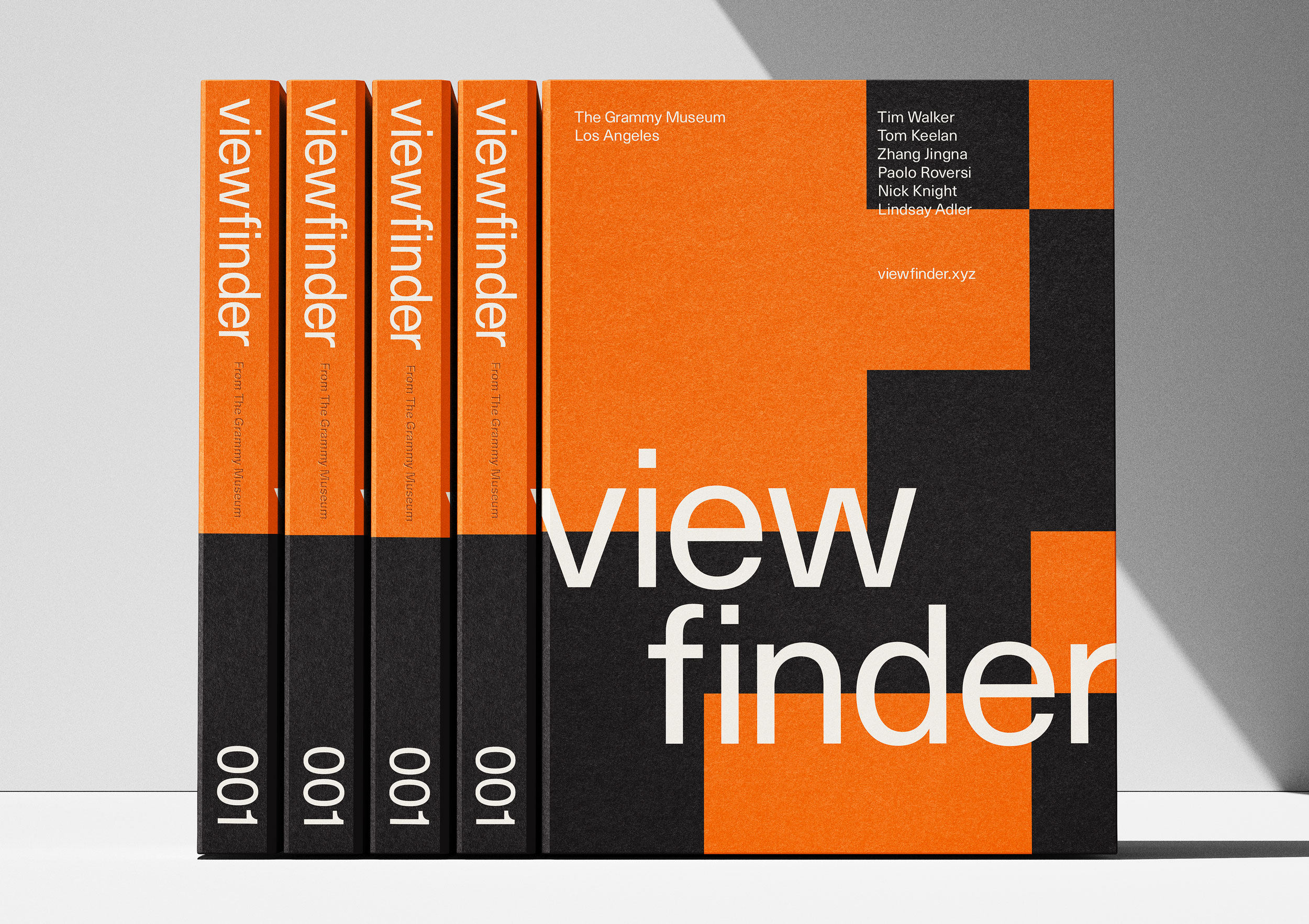
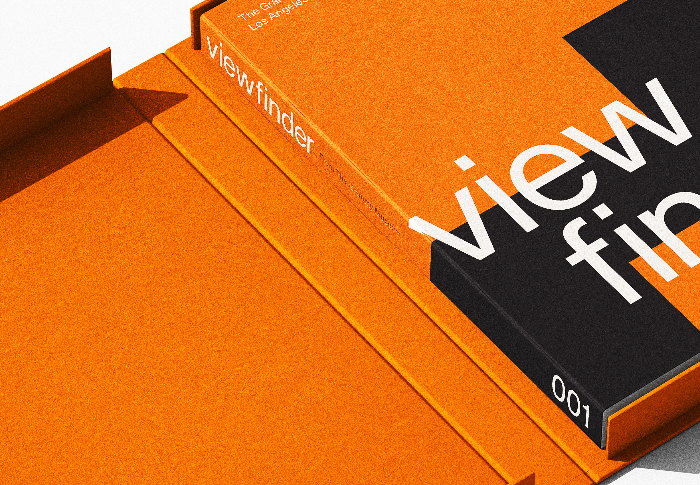
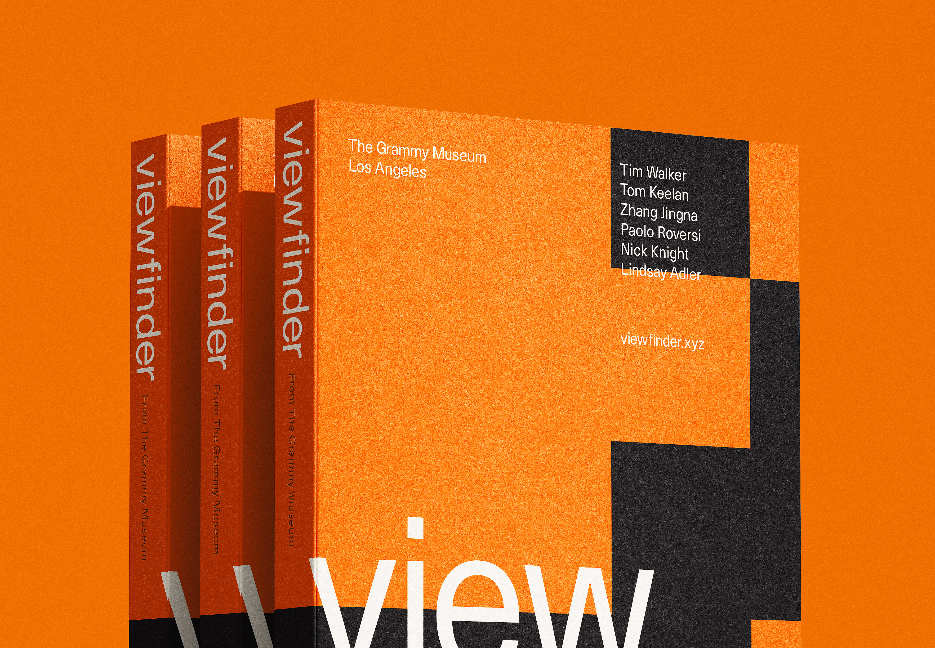
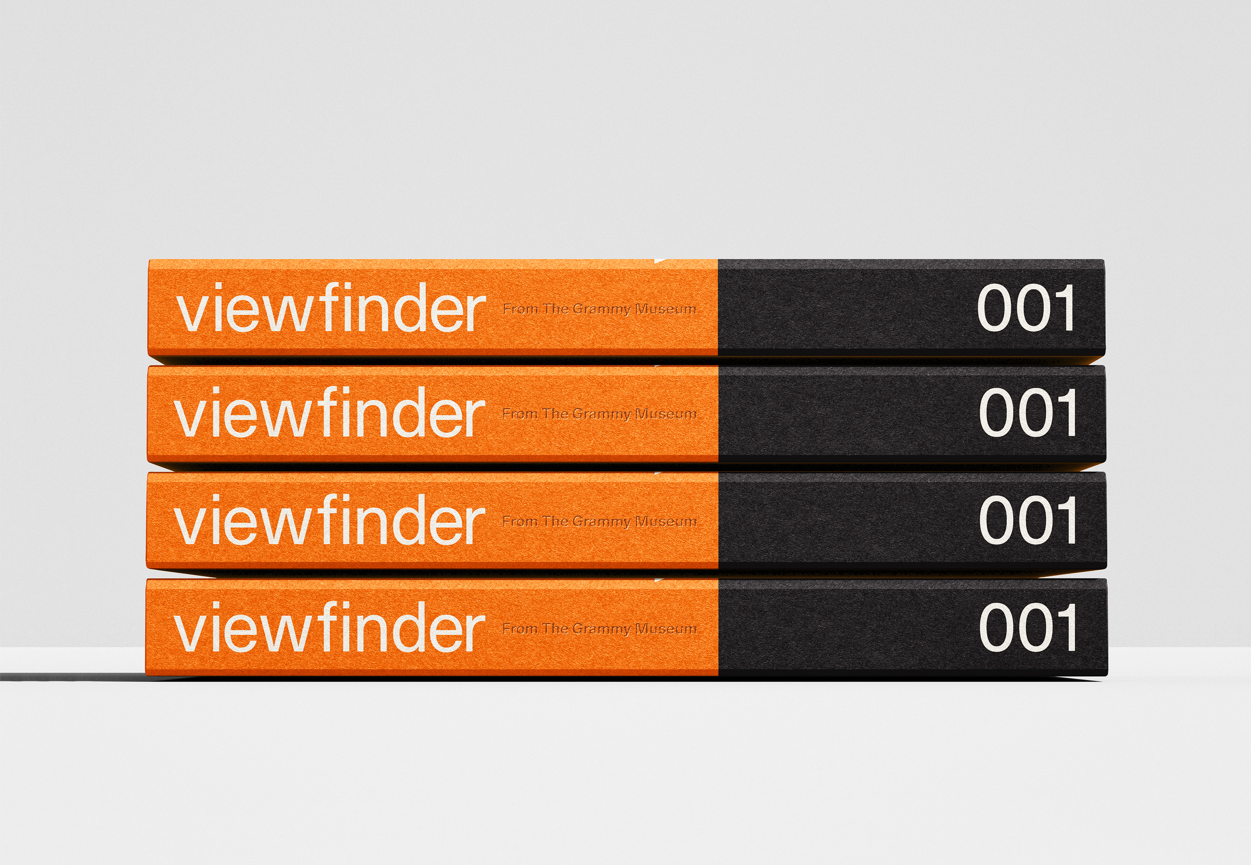
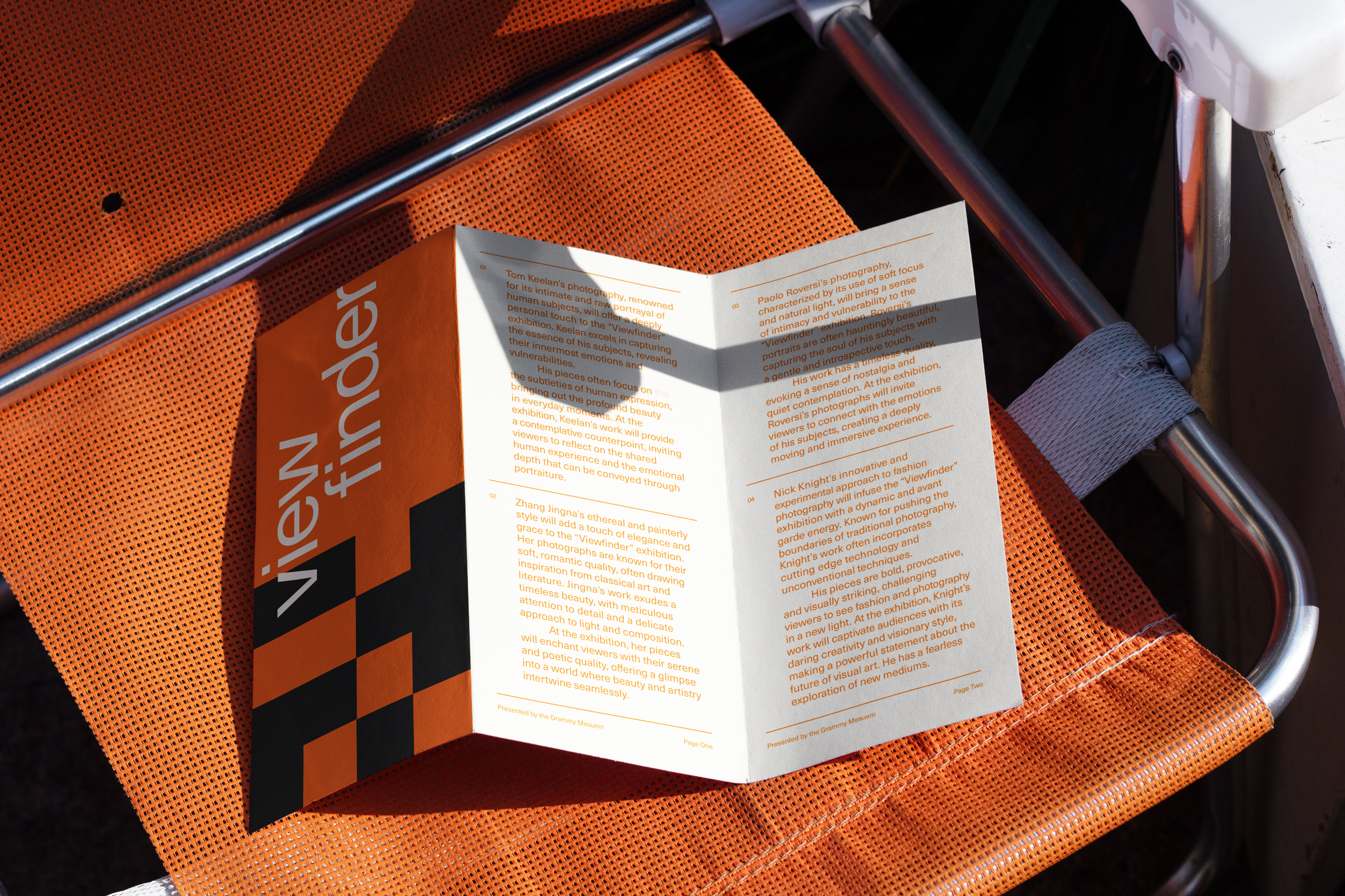
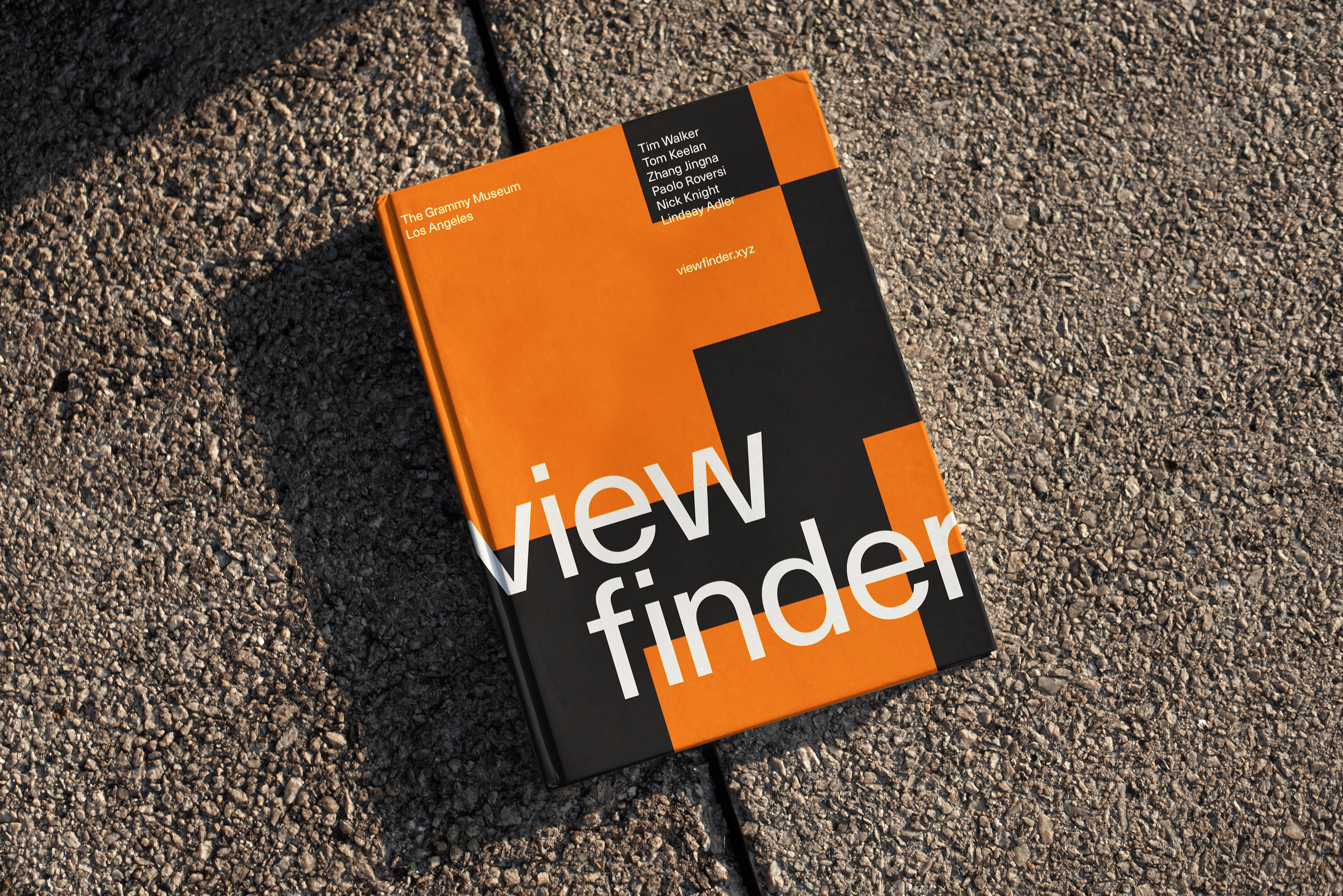
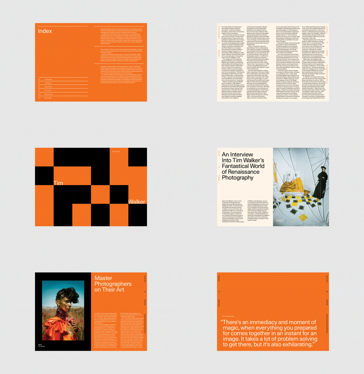
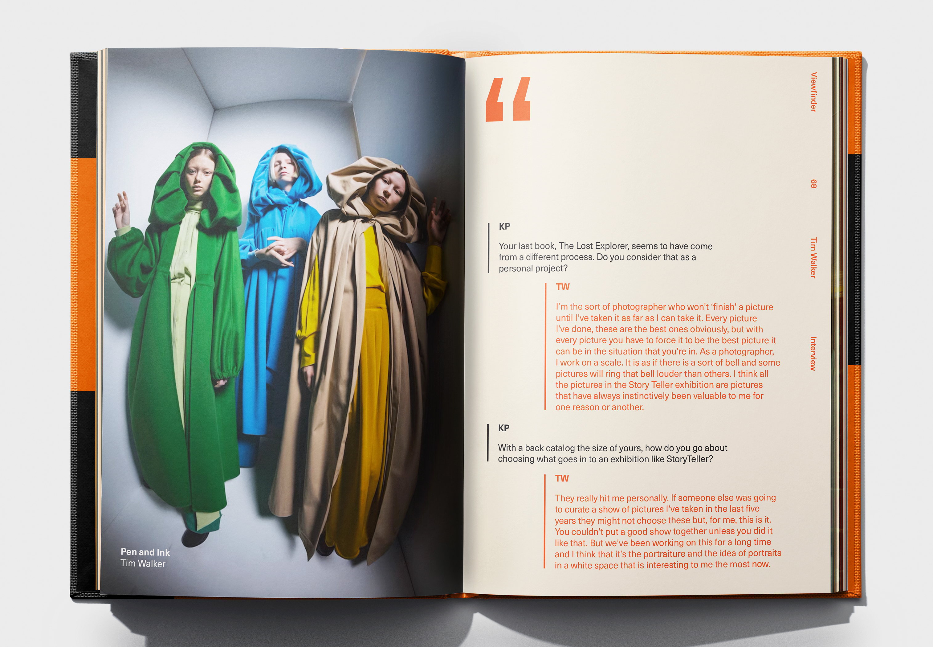
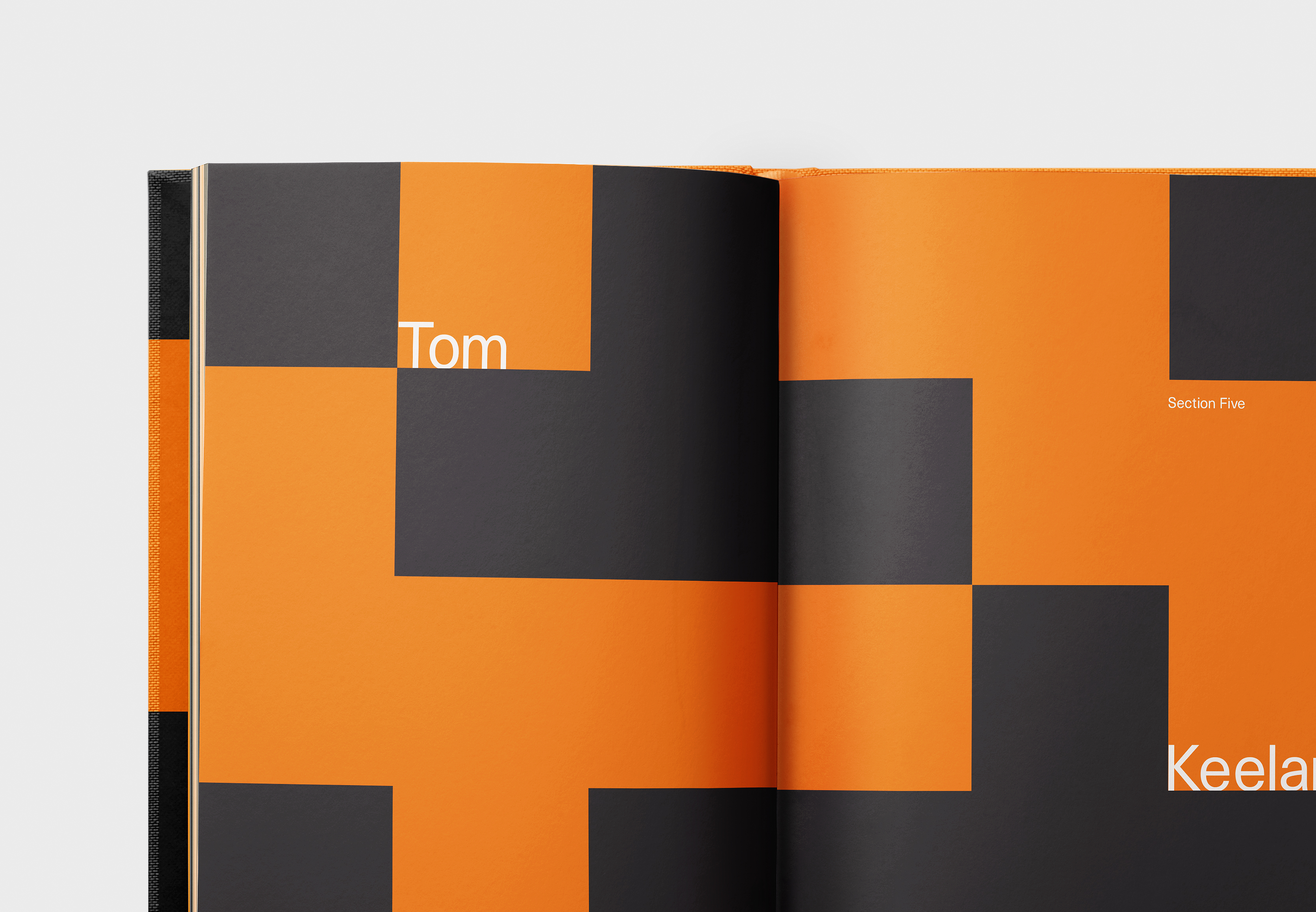
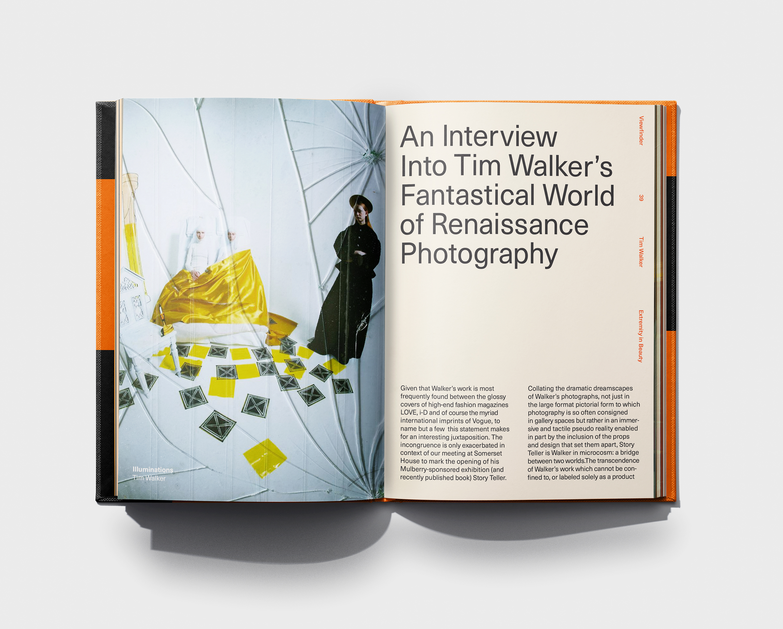
The book, featuring a linen jacket and uniquely numbered copies, reflects a photographer’s perspective, capturing moments through their lens. The 232 pages incorporate square frames to symbolize selective cropping, emphasizing the artistry of what’s shown and what’s left out.
This framing concept shapes the book’s identity, inviting readers to engage with the photographer’s creative process. The design offers a deeper understanding of how each image is thoughtfully curated.
